
Color breathes life into every space, but not everyone’s bold enough to step outside the comfort zone of neutrals. If you’re a home décor enthusiast looking to transform your space with energy, charm, and personality, bright and bold color palettes are the way to go. These palettes not only make a statement but also hold the power to uplift moods and give your home a fresh, modern look.
Consider this your guide to using bright and bold colors thoughtfully in your home, from choosing dynamic combinations to understanding how they affect ambiance.
Why Choose Bright and Bold Colors?
Colors do more than define a room’s aesthetic; they influence emotions and create character. Adding vibrant, daring hues to your space makes it memorable, energizes the environment, and speaks volumes about your personal style. With the right palettes, you can create spaces that are welcoming, inspiring, or even a little dramatic.
Still hesitant? Here’s why bright and bold palettes deserve your attention:
- They add depth: Intense hues create focal points and visual interest.
- They reflect personality: Whether you love daring magentas or uplifting yellows, your palette becomes an extension of you.
- They enhance natural light: Vibrant tones bounce light, making rooms feel larger and brighter.
Dynamic Color Palettes to Elevate Your Space
Here are some stunning bright and bold color palettes tailored for different tastes and spaces.
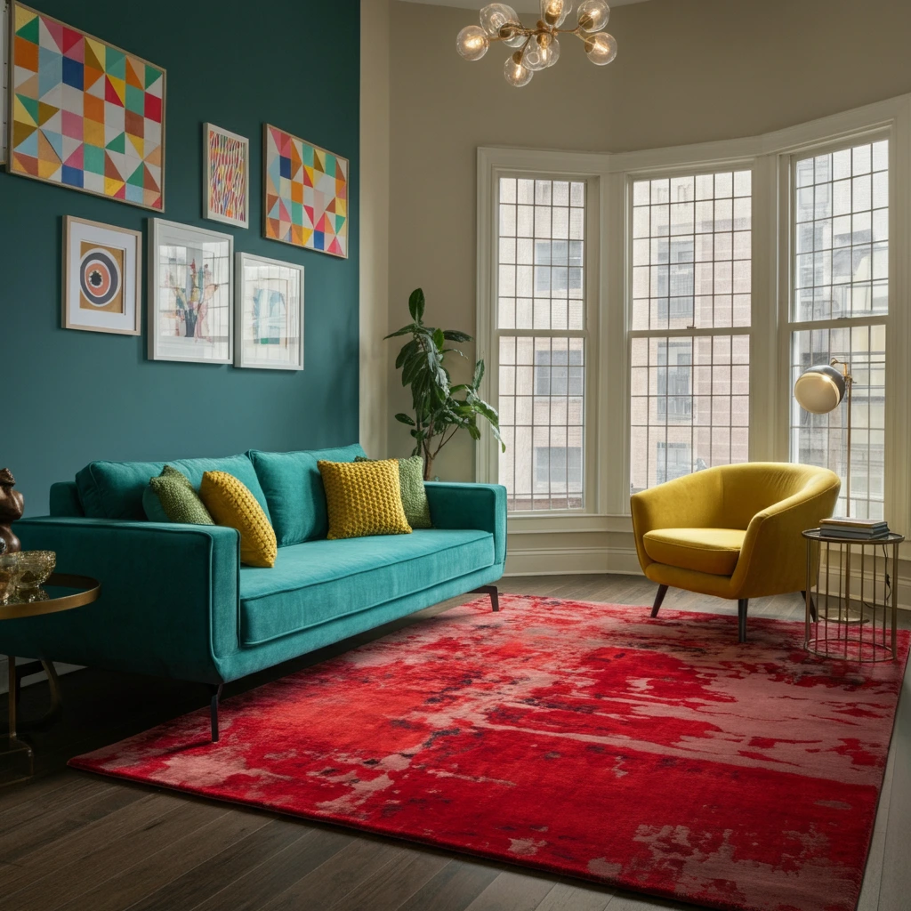
1. Tropical Teal and Sunny Yellow
Bring the vacation vibes into your home! Combining teal and yellow immediately evokes tropical beaches with golden sand and sparkling oceans. Teal adds a sophisticated depth, while yellow infuses cheer and vitality.
Where to Use:
- Living Rooms: Paint an accent wall teal and add yellow throw pillows for pops of energy.
- Kitchens: Use teal cabinets paired with yellow bar stools or accessories.
- Outdoor Spaces: Think teal lounge sofas with vibrant yellow cushions.
2. Hot Pink and Orange Crush
Perfect for those who crave bold, unapologetic designs, this pairing is fiery and contemporary. Hot pink and orange work wonders in creating a playful, high-energy atmosphere.
Where to Use:
- Bedrooms: Bold bedding or curtains in hot pink paired with orange accents.
- Dining Areas: A hot-pink centerpiece paired with orange walls for a signature statement.
- Kids’ Rooms: Playful furniture in these vibrant shades creates a fun environment.
3. Electric Blue and Chartreuse
Electric blue is vibrant and sophisticated, while chartreuse brings a modern zing. Together, they create a futuristic, lively palette.
Where to Use:
- Home Offices: Energize your workspace with chartreuse walls and electric blue accessories.
- Bathrooms: Electric blue tiles paired with chartreuse hand towels or bath mats add a fresh, clean look.
- Accent Furniture: Consider chairs or tables in these shades to punch up monochromatic color schemes.
4. Coral and Turquoise
This duo feels straight out of a dreamy resort. Coral adds warmth and charm, while turquoise keeps things cool and refined, creating balanced harmony.
Where to Use:
- Entryways: Use coral wallpaper with turquoise decorative vases or mirrors.
- Balconies: Pair coral cushions with a turquoise coffee table for a relaxed, seaside vibe.
- Bathrooms: Paint the vanity coral and use turquoise towels for stylish contrast.
5. Lime Green and Violet
For those who love a unique spin, lime green and violet create a sharp, high-contrast palette perfect for making a bold impression.
Where to Use:
- Living Rooms: A violet feature wall paired with a lime green sofa or artwork.
- Dining Areas: Lime green chairs against a violet-painted wall add sophistication.
- Bedrooms: Violet bed linens contrasted with lime green lighting or throw blankets.
How to Pull Off Bright and Bold Colors Without Overdoing It
While bold colors can invigorate your space, it’s essential to strike the right balance. Too much vibrancy can overwhelm or clutter a room. Here are some tips to perfect the look:
Start Small
If you’re new to bright colors, start by incorporating accessories like throw pillows, rugs, or artwork. This lets you test a palette before committing to paint walls or invest in large furniture pieces.
Stick to the 60-30-10 Rule
This classic design rule allocates 60% of a space’s color to dominant tones (usually walls), 30% to complementary colors (furniture), and 10% to accents (pillows, lamps, etc.). This keeps the look cohesive without feeling overpowering.
Use Neutrals for Balance
Bright colors pop even more when paired with neutral tones like white, gray, or beige. For instance, an electric blue couch in a white-painted room feels bold but balanced.
Leverage Natural Light
Natural sunlight enhances bold hues, making them look even more striking. Arrange brighter areas of your home to play with light and colors effectively.
Don’t Forget Texture
Add texture or patterns to your palette to avoid creating a flat appearance. For example, velvety hot-pink cushions or a teal shag rug add dimension.
Bright Colors, Inspired Interiors
Bold color palettes are perfect for reinventing your space and making it uniquely yours. Gone are the days of muted, safe tones ruling every corner of your home. Now is the time to experiment with vibrant combinations that express your style and breathe life into every room.
If you’re ready to take your home décor game to the next level with bright colors but unsure where to begin, consulting with a professional designer could make all the difference. Whether it’s choosing the right paint finishes or striking that elusive balance, expert advice could save you time and effort while achieving a stunning result.
But don’t feel like you have to go all-in with bold hues. A pop of color can go a long way in adding character and interest to any space. Consider incorporating colorful accents through throw pillows, rugs, or statement pieces of furniture. You could also create a focal point by painting an accent wall or installing colorful wallpaper. The key is to find the right balance and mix complementary colors for a harmonious look.
Another way to add pops of color without overwhelming your space is by using natural elements such as plants or flowers. Not only do they bring in vibrant shades, but they also add texture and life to any room. Furthermore, incorporating nature into your home décor has been shown to have
| Pros of Incorporating Natural Elements | Cons of Incorporating Natural Elements |
|---|---|
| Adds vibrant colors and texture | Requires regular maintenance and care |
| Enhances the ambiance of the space | Some plants may not thrive indoors |
| Improves air quality and reduces stress | Certain plants can be toxic to pets |
| Brings life and freshness to the room | Initial setup can be costly |
FAQ
Q: What are some easy-to-maintain natural elements to incorporate into home décor?
A: Some low-maintenance options include succulents, snake plants, or preserved moss. These require minimal watering and thrive in various indoor conditions.
Q: How can I ensure my plants thrive indoors?
A: Make sure to consider factors like light, temperature, and humidity levels specific to the plants you choose. Research each plant’s care requirements to provide the optimal environment.
Q: Are there natural décor options safe for homes with pets?
A: Yes, there are many non-toxic plant options like spider plants, parlor palms, and ferns. Always double-check the safety of specific plants to avoid harmful effects on pets.
Q: Can I incorporate natural elements without adding plants?
A: Definitely! You can use materials like wood, stone, or woven fibers to bring natural textures and warmth to your space without the need for maintenance.
Q: How much does it typically cost to start decorating with natural elements?A: Costs can vary depending on the materials or plants you choose. Starting small with a few plants or natural accent pieces can be very affordable. Larger installations, like custom wood furniture, may require a higher initial investment.


Leave a Reply
You must be logged in to post a comment.